Converse App Design

The legendary Converse shoe company has withstood the test of time for decades and remains a keystone in the fashion of each generation.
Objectives: Research, construct a user persona, create a storyboard, map the user flow, create wireframes, design and prototype, create spec doc
Role: UX/UI design, research, user flow, wireframes, prototype
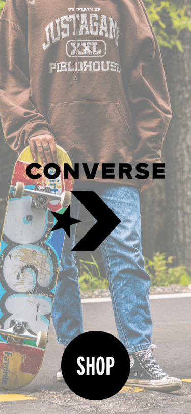
Problem: Converse does not currently have a U.S. shopping app.
Research

Timeline
1908: Marquis Mills founds Converse.
1917: Converse begins selling the predecessor to the Chuck Taylor
All Star
1921: Chuck Taylor hired
1922: Converse launches improved Chuck Taylor All Star
2003: Nike acquires Converse
Facts
Brand
Statista Brand Survey
Converse has 87% brand awareness
in the U.S.
69% of users show brand loyalty.
26% of sneaker wearers in the U.S.
wear Converse.
Gitnux Statistics and Trends
Around 100 million pairs of
sneakers are sold annually.
The average consumer spends $80
on the site.
Audience
Similar Web
18-24: 34.70%
25-34: 28.86%
35-44: 15.63%
45-54: 10.68%
55-64: 6.42%
65+: 3.76%
Female: 60.26%
Male: 39.74%
App v. Website
JMango 360
Mobile users spend 90% of their
time on apps.
Apps have a higher retention rate
than websites.
Brand awareness remains high
thanks to app icons showing on screens.
Newstore
88% of consumers have at least one shopping app.
Users 18-44 years old are more
likely to shop on an app.

User Flow
Shopping Flow
The app flow and design simplifies the shopping process for the user.
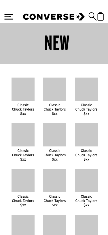
Splash—>Shop (home)—>Category—>Product—>
Add to Cart—>Cart—>Checkout—>Order Confirmation
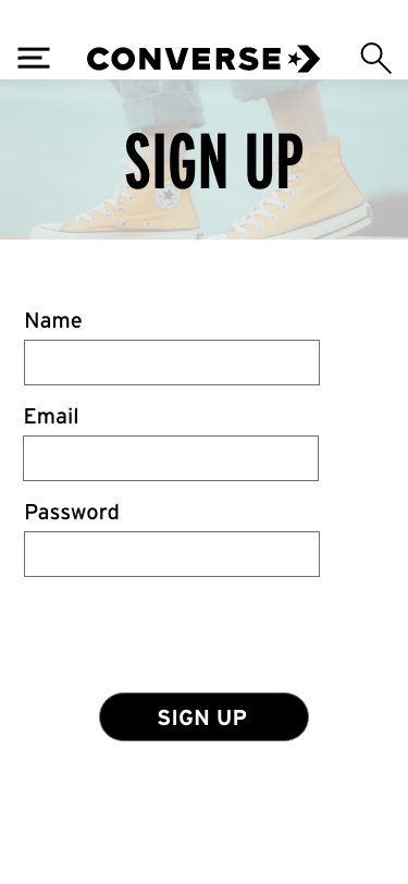
From the header, users access the Menu, Cart, Home, and Search states. From the menu, users can access the Category states plus the Account state. On the Account state, users can access the Sign-In state, which then connects to a sign-up state.
On all states except for Splash and Shop, users can access the Shop state by tapping the logo. The search function directs users to a state that will populate items that match their query.

User Persona
Audience: Gen Z; 25-35 creative professionals
User Persona
Name: Lucy Smith
Age: 30
Career: Freelance graphic designer
Detail: Self-expression and creativity are important to her. Converse a source of nostalgia. She is a repeat customer.
Problem: Lucy has been wearing the same pair of Converse for a couple of years. The soles are starting to wear down. She just got a new client and would like to celebrate by buying a new pair of Chuck Taylors.
Solution: Create an app to allow her to easily buy a new pair of Converse.
Ideate
For the overall design, I chose to keep it simple. When the user opens the app, they will first see the splash page and then hit the shop button, which leads them to the home state. From the home state, the user can access the different shoe categories. From there, the user will add items to their cart and checks out. The hamburger menu at the top right will give the user access to the menu, with buttons to each shoe category and account information. On the account page, users can either log in or sign up for the app.
Wireframes


Design
During the Design and Prototyping phase, I refined the overall design. I chose to use a black and white color scheme for text and buttons, as that is what Converse currently uses. I also added states to let the user know that they’ve created an account and that they’ve successfully completed their order.